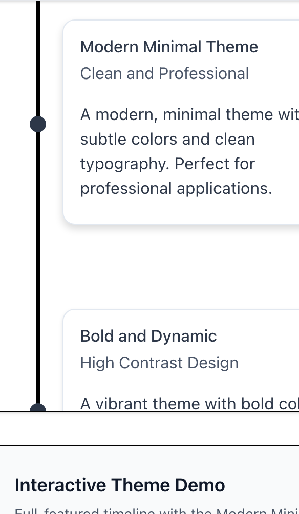
Theme
React-Chrono provides extensive theme customization capabilities through the theme object. You can customize colors for all visual elements including cards, icons, buttons, interactive states, and effects to match your brand or design system.
The library provides default themes optimized for both light and dark modes. All theme properties are optional and will fall back to sensible defaults.
Core Theme Properties
Card Colors
| Property | Type | Default (Light) | Description |
|---|---|---|---|
| cardBgColor | string | #ffffff | Background color of timeline cards |
| cardDetailsBackGround | string | #ffffff | Background color of the card details section |
| cardDetailsColor | string | #374151 | Text color for card details/content |
| cardMediaBgColor | string | #f8fafc | Background color for media elements in cards |
| cardSubtitleColor | string | #6b7280 | Color of card subtitles |
| cardTitleColor | string | #007FFF | Color of card titles |
Primary & Secondary Colors
| Property | Type | Default (Light) | Description |
|---|---|---|---|
| primary | string | #007FFF | Primary brand color used throughout the timeline |
| secondary | string | #ffdf00 | Secondary accent color |
Icon Colors
| Property | Type | Default (Light) | Description |
|---|---|---|---|
| iconBackgroundColor | string | #007FFF | Background color of timeline point icons |
| iconColor | string | #007FFF | Color of icons and icon elements |
Timeline Title Colors
| Property | Type | Default (Light) | Description |
|---|---|---|---|
| titleColor | string | #007FFF | Color of timeline item titles |
| titleColorActive | string | #007FFF | Color of active timeline item titles |
Toolbar Colors
| Property | Type | Default (Light) | Description |
|---|---|---|---|
| toolbarBgColor | string | #f1f5f9 | Background color of the timeline toolbar |
| toolbarBtnBgColor | string | #ffffff | Background color of toolbar buttons |
| toolbarTextColor | string | #1e293b | Text color for toolbar elements |
Interactive Button States
| Property | Type | Default (Light) | Description |
|---|---|---|---|
| buttonHoverBgColor | string | #e2e8f0 | Background color when hovering over buttons |
| buttonActiveBgColor | string | #007FFF | Background color for active/pressed buttons |
| buttonActiveIconColor | string | #ffffff | Icon color for active buttons |
Border Colors
| Property | Type | Default (Light) | Description |
|---|---|---|---|
| buttonBorderColor | string | #e2e8f0 | Border color for buttons and interactive elements |
| buttonHoverBorderColor | string | #007FFF | Border color when hovering over buttons |
| buttonActiveBorderColor | string | #007FFF | Border color for active buttons |
Visual Effects
| Property | Type | Default (Light) | Description |
|---|---|---|---|
| shadowColor | string | rgba(0, 0, 0, 0.1) | Color for shadows and depth effects |
| glowColor | string | rgba(0, 127, 255, 0.2) | Color for glow effects on focus/hover |
| searchHighlightColor | string | - | Color for search result highlighting |
Nested Timeline Cards
| Property | Type | Default (Light) | Description |
|---|---|---|---|
| nestedCardBgColor | string | #f8fafc | Background color for nested timeline cards |
| nestedCardDetailsBackGround | string | #f8fafc | Background color for nested card details |
| nestedCardDetailsColor | string | #374151 | Text color for nested card details |
| nestedCardSubtitleColor | string | #6b7280 | Subtitle color for nested cards |
| nestedCardTitleColor | string | #1f2937 | Title color for nested cards |
Dark Mode Toggle
| Property | Type | Default (Light) | Description |
|---|---|---|---|
| darkToggleActiveBgColor | string | #007FFF | Background color for active dark mode toggle |
| darkToggleActiveIconColor | string | #ffffff | Icon color for active dark mode toggle |
| darkToggleActiveBorderColor | string | #007FFF | Border color for active dark mode toggle |
| darkToggleGlowColor | string | rgba(0, 127, 255, 0.2) | Glow effect color for dark mode toggle |
Layout Colors
| Property | Type | Default (Light) | Description |
|---|---|---|---|
| timelineBgColor | string | #ffffff | Background color for the entire timeline container |
| textColor | string | inherit | General text color (fallback) |
| detailsColor | string | #374151 | Color for detail text elements |
Dark Mode Support
React-Chrono includes built-in dark mode themes with optimized colors for better contrast and readability in dark environments.
v3.0 Syntax
jsx
<Chrono
  items={items}
  darkMode={{
    enabled: false,
    showToggle: true  // Show dark mode toggle button
  }}
  theme={{
    // Your custom theme properties work in both light and dark modes
    primary: "#3b82f6",
    secondary: "#fbbf24",
  }}
/>
Using v2.x Syntax (Still Supported)
jsx
<Chrono
  items={items}
  enableDarkToggle={true}
  theme={{
    primary: "#3b82f6",
    secondary: "#fbbf24",
  }}
/>
Example Usage
Basic Customization
jsx
<Chrono
  items={items}
  theme={{
    primary: "#2563eb",
    secondary: "#7c3aed",
    cardBgColor: "#f8fafc",
    cardTitleColor: "#1e293b",
    titleColor: "#2563eb",
    titleColorActive: "#7c3aed",
  }}
/>
Advanced Brand Customization
jsx
<Chrono
  items={items}
  theme={{
    // Brand colors
    primary: "#2d3748",
    secondary: "#ed8936",

    // Card styling
    cardBgColor: "#ffffff",
    cardTitleColor: "#2d3748",
    cardSubtitleColor: "#4a5568",
    cardDetailsColor: "#718096",

    // Interactive states
    buttonHoverBgColor: "#e2e8f0",
    buttonActiveBgColor: "#ed8936",
    buttonActiveIconColor: "#ffffff",

    // Effects
    shadowColor: "rgba(0, 0, 0, 0.1)",
    glowColor: "rgba(237, 137, 54, 0.3)",
  }}
/>
High Contrast Theme
jsx
<Chrono
  items={items}
  theme={{
    cardBgColor: "#000000",
    cardTitleColor: "#ffffff",
    cardDetailsColor: "#ffffff",
    iconColor: "#00ff00",
    buttonActiveBgColor: "#ffff00",
    buttonActiveIconColor: "#000000",
    shadowColor: "rgba(255, 255, 255, 0.3)",
  }}
/>
Theme Inheritance
Custom theme properties are merged with the default theme, so you only need to specify the properties you want to customize. The library automatically handles:
- Color fallbacks: If a specific color isn't provided, sensible defaults are used
- Dark mode integration: Your custom colors work seamlessly with the built-in dark mode toggle
- Accessibility: Default themes maintain WCAG AA contrast ratios
Best Practices
- Maintain contrast ratios: Ensure sufficient contrast between text and background colors for accessibility
- Test in both modes: Verify your custom theme works well in both light and dark modes
- Use semantic colors: Consider the meaning of each color property and use appropriate values
- Brand consistency: Use your brand's color palette to create a cohesive look