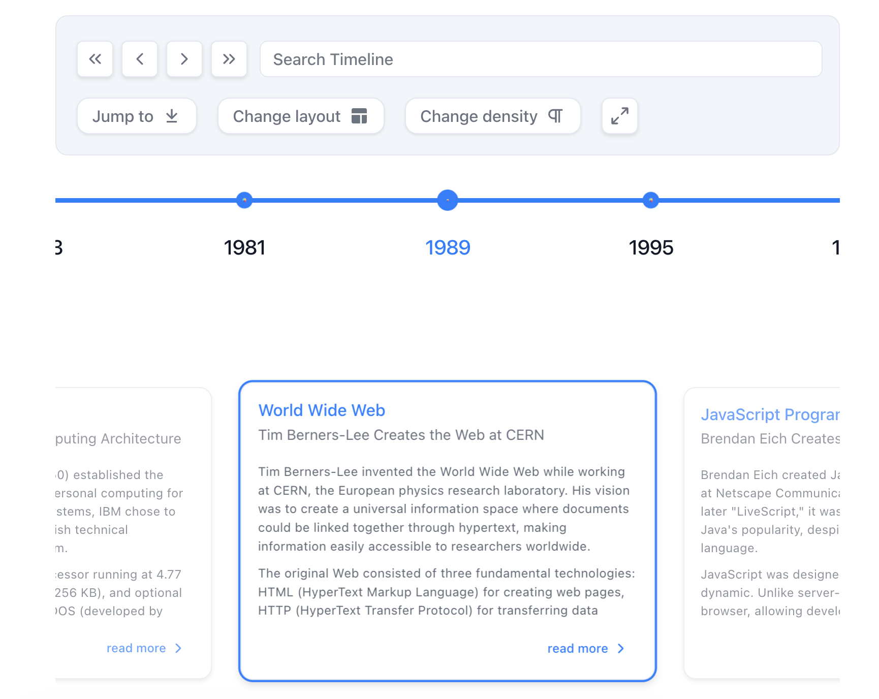
Horizontal Mode
In horizontal mode, React-Chrono displays timeline cards horizontally, providing users with a new and visually distinct way to display events. By default, only one timeline card is displayed at a time. Users can navigate through the cards using the navigation arrows or the keyboard.
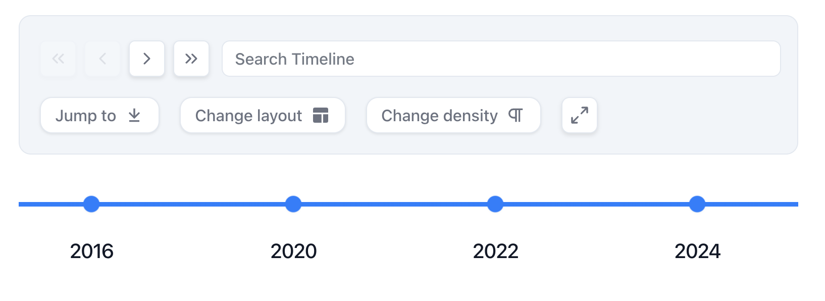
To display all the timeline cards at once, use the horizontal-all mode. This enables users to scroll through the entire timeline horizontally and view all the timeline cards simultaneously.
Adjusting the Space Between Timeline Cards
React-Chrono's horizontal mode allows you to adjust the space between each timeline item using the layout.itemWidth configuration. This value (in pixels) sets the width of each timeline section, allowing you to customize the distance between each card.
Example - Standard Horizontal Mode (v3.0)
import React from 'react';
import { Chrono } from 'react-chrono';

const items = [
  {
    title: "January 2022",
    cardTitle: "Event 1",
    cardSubtitle: "Event 1 Subtitle",
    cardDetailedText: "This is the first event on the timeline.",
  },
  {
    title: "February 2022",
    cardTitle: "Event 2",
    cardSubtitle: "Event 2 Subtitle",
    cardDetailedText: "This is the second event on the timeline.",
  },
  {
    title: "March 2022",
    cardTitle: "Event 3",
    cardSubtitle: "Event 3 Subtitle",
    cardDetailedText: "This is the third event on the timeline.",
  }
];

const HorizontalTimeline = () => {
  return (
    <Chrono
      items={items}
      mode="horizontal"
      layout={{
        itemWidth: 150
      }}
    />
  );
};

export default HorizontalTimeline;
Interactive Demo
Using v2.x Syntax (Still Supported)
<Chrono
  items={items}
  mode="HORIZONTAL"
  itemWidth={150}
/>
Example - Show All Cards Horizontally
To display all cards at once in horizontal mode, use the horizontal-all mode:
const HorizontalAllTimeline = () => {
  return (
    <Chrono
      items={items}
      mode="horizontal-all"
      layout={{
        itemWidth: 150
      }}
    />
  );
};
Using v2.x Syntax (Still Supported)
<Chrono
  items={items}
  mode="HORIZONTAL"
  showAllCardsHorizontal={true}
  itemWidth={150}
/>
In the examples above, layout.itemWidth is set to 150, which creates a space of 150 pixels between each timeline section. The standard horizontal mode displays one card at a time, while horizontal-all mode displays all cards simultaneously.