Dark Mode
React Chrono v3.0 includes built-in dark mode support with automatic theme switching and a user-friendly toggle button.
Enabling Dark Mode
Use the darkMode configuration to enable dark mode functionality:
<Chrono
  items={items}
  darkMode={{
    enabled: true,
    showToggle: true  // Shows toggle button in toolbar
  }}
/>
Configuration Options
| Property | Type | Default | Description |
|---|---|---|---|
enabled | boolean | false | Enable dark mode functionality |
showToggle | boolean | false | Show dark mode toggle button in toolbar |
Dark Mode Features
Automatic Theme Switching
When dark mode is enabled, React Chrono automatically applies dark theme colors to all timeline elements:
- Timeline cards get darker backgrounds
- Text colors adjust for readability
- Timeline points and lines use dark theme colors
- Toolbar and controls adapt to dark theme
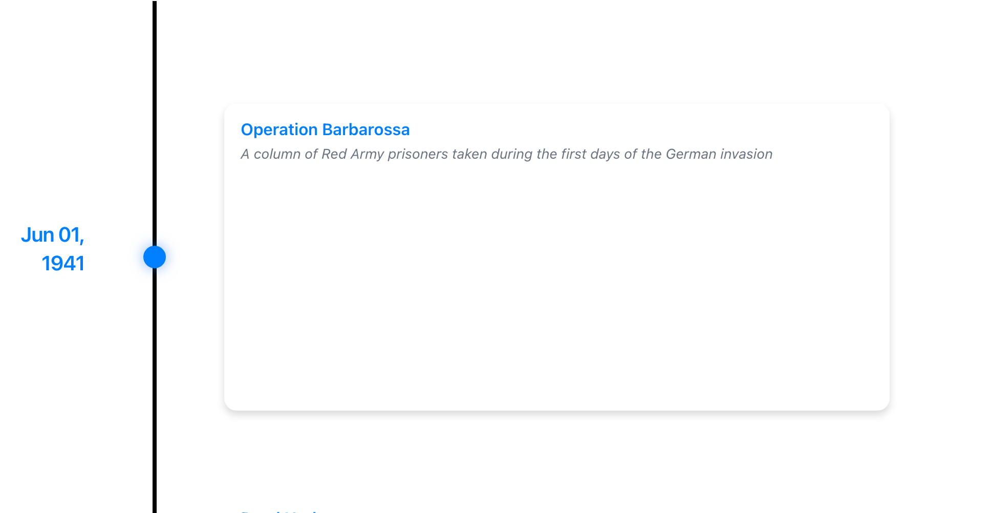
Light Mode:
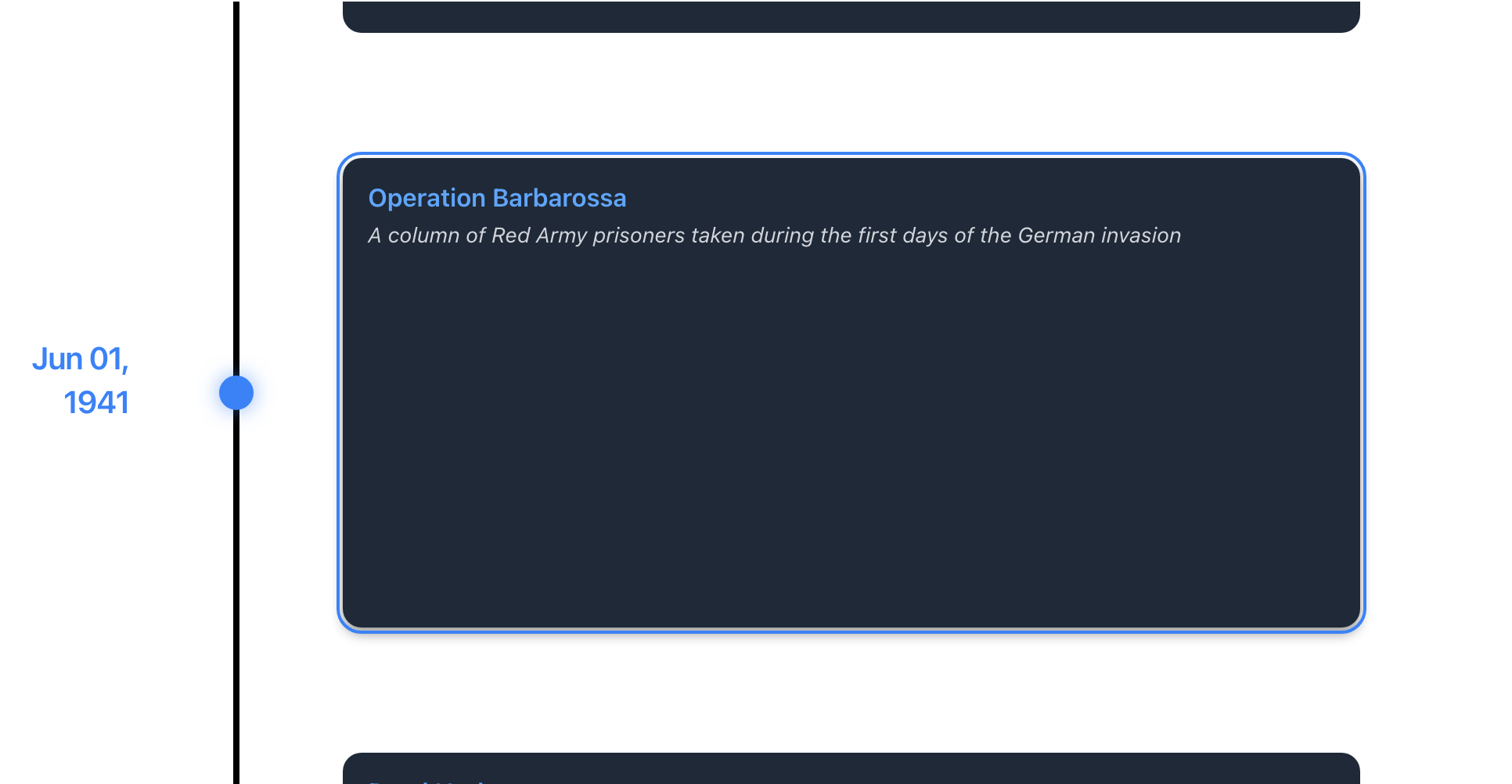
Dark Mode:
Toggle Button
When showToggle is set to true, a toggle button appears in the toolbar allowing users to switch between light and dark themes dynamically.
<Chrono
  items={items}
  darkMode={{
    enabled: false,      // Start in light mode
    showToggle: true     // Allow users to switch
  }}
/>
Customizing Dark Mode Theme
You can customize the dark mode appearance using enhanced theme properties:
<Chrono
  items={items}
  darkMode={{
    enabled: true,
    showToggle: true
  }}
  theme={{
    // Base dark colors
    primary: '#60a5fa',
    cardBgColor: '#1f2937',
    cardTitleColor: '#f9fafb',
    textColor: '#e5e7eb',

    // Dark mode specific
    iconColor: '#60a5fa',
    buttonHoverBgColor: '#374151',
    buttonActiveBgColor: '#60a5fa',
    shadowColor: 'rgba(0, 0, 0, 0.3)',
    glowColor: 'rgba(96, 165, 250, 0.5)',

    // Dark toggle specific
    darkToggleActiveBgColor: '#60a5fa',
    darkToggleActiveIconColor: '#ffffff',
    darkToggleGlowColor: 'rgba(96, 165, 250, 0.4)'
  }}
/>
Enhanced Dark Mode Theme Properties
React Chrono v3.0 provides 36 comprehensive theme properties, including 13 specifically designed for enhanced dark mode customization:
Button States
buttonHoverBgColor- Button background on hoverbuttonActiveBgColor- Button background when activebuttonActiveIconColor- Icon color for active buttonsbuttonBorderColor- Border color for buttonsbuttonHoverBorderColor- Border color on hoverbuttonActiveBorderColor- Border color when active
Visual Effects
iconColor- Color for icons in dark modeshadowColor- Color for shadows and depth effectsglowColor- Color for glow effects and focus states
Dark Toggle Specific
darkToggleActiveBgColor- Background when toggle is activedarkToggleActiveIconColor- Icon color when toggle is activedarkToggleActiveBorderColor- Border color when toggle is activedarkToggleGlowColor- Glow effect color for dark mode toggle
Example: Complete Dark Mode Setup
import React from "react";
import { Chrono } from "react-chrono";

const items = [
  {
    title: "2024-01",
    cardTitle: "Project Launch",
    cardSubtitle: "New Beginning",
    cardDetailedText: "Started our exciting new project with the team.",
  },
  {
    title: "2024-06",
    cardTitle: "Milestone Reached",
    cardSubtitle: "Success",
    cardDetailedText: "Achieved our first major milestone ahead of schedule.",
  },
];

function DarkModeTimeline() {
  return (
    <div style={{ width: '100%', height: '600px' }}>
      <Chrono
        items={items}
        mode="vertical"
        darkMode={{
          enabled: true,
          showToggle: true
        }}
        theme={{
          primary: '#60a5fa',
          cardBgColor: '#1f2937',
          cardTitleColor: '#f9fafb',
          cardSubtitleColor: '#d1d5db',
          textColor: '#e5e7eb',
          timelineBgColor: '#111827',
          iconColor: '#60a5fa',
          buttonActiveBgColor: '#60a5fa',
          shadowColor: 'rgba(0, 0, 0, 0.3)',
          glowColor: 'rgba(96, 165, 250, 0.5)'
        }}
      />
    </div>
  );
}

export default DarkModeTimeline;
Interactive Demo
Using v2.x Syntax (Still Supported)
<Chrono
  items={items}
  mode="vertical"
  darkMode={true}              // Enable dark mode (v2 boolean)
  enableDarkToggle={true}      // Show toggle button (v2 boolean)
  theme={{ /* dark theme colors */ }}
/>
Responding to Theme Changes
You can listen to theme changes using the onThemeChange callback:
<Chrono
  items={items}
  darkMode={{
    enabled: true,
    showToggle: true
  }}
  onThemeChange={() => {
    console.log('Theme changed');
    // Note: Callback doesn't receive theme parameter
    // Track theme state separately if needed
  }}
/>
Best Practices
- Provide Toggle Control - Always enable
showToggle: trueto let users choose their preferred mode - Test Both Modes - Ensure your timeline looks good in both light and dark modes
- Respect User Preference - Save the user's theme choice and restore it on subsequent visits
- High Contrast - Ensure sufficient contrast ratios (WCAG AA: 4.5:1 for text)
- Consistent Theming - Use the enhanced dark mode theme properties for a polished look
TIP
Dark mode is not just about inverting colors - use the enhanced theme properties to create a beautiful dark experience with proper shadows, glows, and visual hierarchy.